Screen Layout and Navigation
Working Area
The main working area is the main area of the screen where data entry takes place.
Data Entry Elements
The common data entry elements found in the working area are:
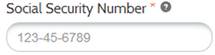
· Data Entry Fields: Empty boxes identified by a label.
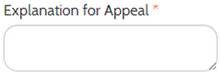
· Text Boxes: Large, empty boxes that allow free form, text-based comments to be typed within them.
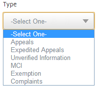
· Drop-down Lists: Drop-down lists are fields that display a list of items when the field is clicked. When an item is selected from the list, it automatically displays in the field. No data can be directly typed into the field.
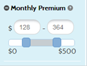
· Sliders: The slider comes into play when the applicant is selecting a certain amount of money. The user clicks and drags the handle with his or her cursor, and the number in the text field reflects this change.
· Radio Buttons: Used to select a single item among two or more mutually exclusive items. Only one button can be selected at a time.

· Checkboxes: Selected to turn an action/item on or off. If there are several check boxes, more than one can be selected at a time.

Notifications
When performing tasks, the system displays messages about their outcomes and procedures.
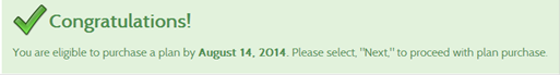
· Success: A congratulations message is displayed if the task is successfully completed.
· Error: An error message is displayed if the task is not successfully completed and displays the reasons for the error.

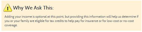
· Warning: A warning message is displayed in an orange box and it provides directions or additional information about the task being performed.
· Information Alert: An information alert is displayed in a blue box and it provides information related to the task being performed.

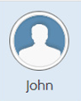
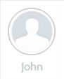
· Member Icon: On the application screens, individuals can be added to a household and/or have their information edited. On these screens, the selected household member is highlighted, while the other household members are greyed out.
· Dashboard Tabs – Users’ view is centralized in a control dashboard; the dashboard has tabs that allow switching views between related groups of pages. The tabs are different for each type of user.
Data Elements Legend
Depending on the programs requested for the case, data entry fields can be identified as Mandatory, which means the element is mandatory, so information must be entered in order to continue. Mandatory fields are identified with an asterisk.
Page Icons
Page icons are graphic symbols that appear within the working area, and within the page itself. Clicking a page icon activates a specific function. Some page icons are universal, meaning that they appear on all pages; other icons appear only on certain pages. When the icon is used, explanatory text appear when the user hovers over the icon.
The icons used in RI UHIP are:
· Search
· Added/Add to Favorites
· Checkmark
· Close
· Remove
· Estimated Time to Complete
· Reset Search
· Updated Information
· Edit
· Checked Box
· Back/Next Page Flow
· Maximize/Minimize Section
· Field Level Help
· Upload
· Add/Remove Plan from comparing it with other plans
· Date Selection
· Sort
· Shopping Cart
Navigation and Action Buttons
Navigation buttons are located at both the top and bottom of the working area within a page. Navigation buttons are either green or blue and contain a label, which indicates its action. Some of the typical navigation buttons include:
· Home button - Goes back to the Home Page.
· Back button - Moves back one page in the application pages.
· Next button - Moves forward one page in the application pages.
Action buttons perform specific functions such as conducting a search, printing a document, or saving information to the system databases. They may be located at the top or bottom of a page, as well as above or below sections within the page. Some of the typical action buttons include:
· Browse button – Browses the computer files to upload a document.
· Upload button – Uploads documents that have been selected.
· Remove button – Removes documents that have been selected.
· Search button – Performs different types of searches in the system.
· Apply filters button – Filters out healthcare plans based on the criteria set by the user.
· Print button – Prints the highlights of the plans being compared in the Compare Plans screen.
· Check out button – Checks-out the plan selected for purchase in the user’s shopping cart.
· Edit button – Allows a user to change the information entered in a page.
· Reset button – Clears the information entered in a page.